JBF website redesign

My Role
Project Name: JBF website redesign
Duration: 8 hour
Role: UX/UI Designer
Overview
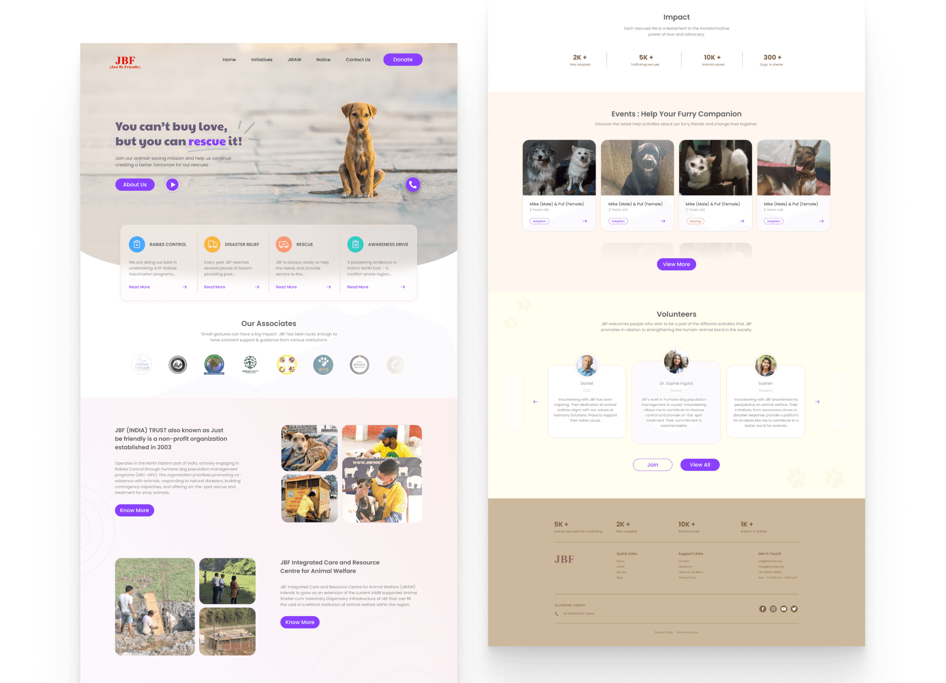
Conducting a UX/UI audit for JBF (Just Be Friendly), an NGO operating in North Eastern India, dedicated to Rabies Control and humane dog population management programs (ABC-ARV). Beyond animal welfare, JBF responds to natural disasters, builds contingency capacities, and provides on-the-spot rescue and treatment for stray animals.
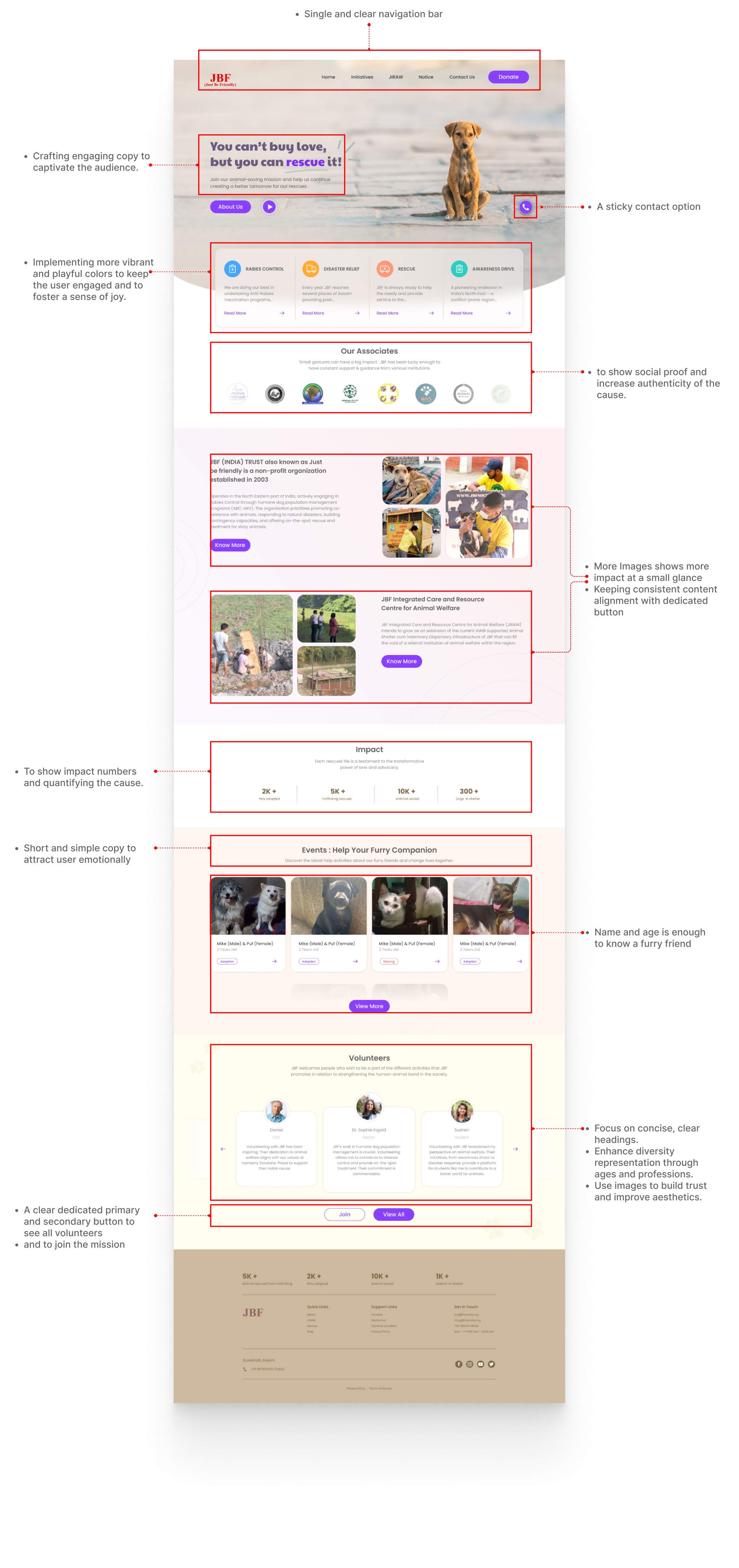
This project aims to enhance JBF's digital presence by applying UX laws and design principles to their landing page. By improving design, navigation, and user interfaces, the goal is to communicate JBF's mission effectively and encourage active support for their initiatives.
Goal
This project addresses user interaction nuances to align the digital presence with JBF's overarching goals. The intent is to transform the website into a compelling platform, inspiring visitors to contribute actively to the cause.
Usability testing
Conducted remotely via screen-sharing and recording tools
Participants verbalize their thoughts while performing tasks
Each session lasts approximately 10-15 minutes
Participant/User
Sanjay (17) Final year high school student. Almost every hour of the day using social media and have a pet.
Jennifer (20) Final year engineering student. Actively participates on social activities.
Ajay (25) Having an interest in IT. On average spend 60–80 minutes on websites in a day.
Manju (29) A Freelance worker, working as a designer who has a pet.
Sameer (37) Worker in Bombay . An animal doctor.
Scenario and Task
Navigation Ease: Locate the section on the website that details JBF's initiatives for rabies control. How easy was it to find this information?
Content Clarity: Read about the 'Disaster Relief' efforts undertaken by JBF. Is the information provided clear and easy to understand?
Contact Information Accessibility: Try to find the contact information for JBF. How easy is it to locate their phone number and email address?
Donation Process: Attempt to navigate to the donation page. Is the process straightforward and user-friendly?
Search Functionality: Use the website's search feature to find information about volunteer opportunities. Assess how effectively the search tool works.
Link Functionality: Check if all the hyperlinks on the main navigation menu are working correctly and leading to the appropriate pages.
Visual Appeal: Evaluate the overall visual appeal of the website. Does the design, color scheme, and imagery effectively represent the mission of JBF?
Accessibility Features: Look for accessibility features such as text-to-speech or high-contrast mode. How well does the website cater to users with different needs?

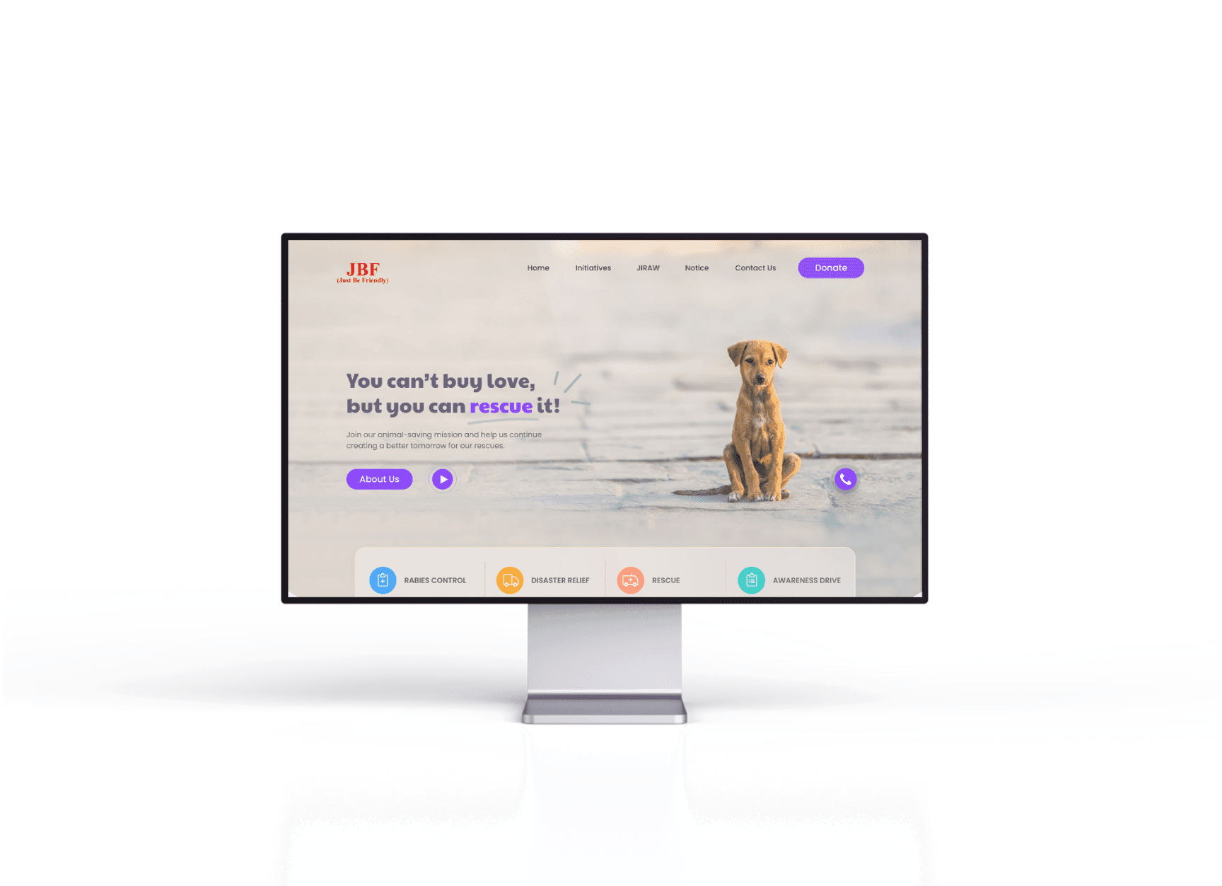
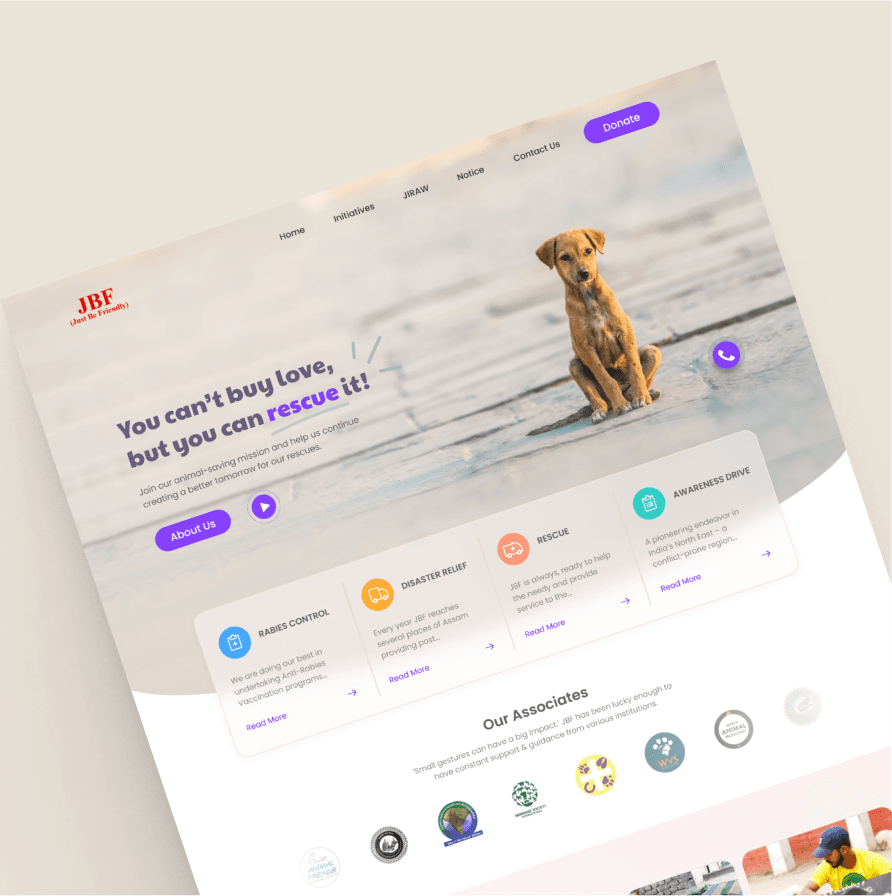
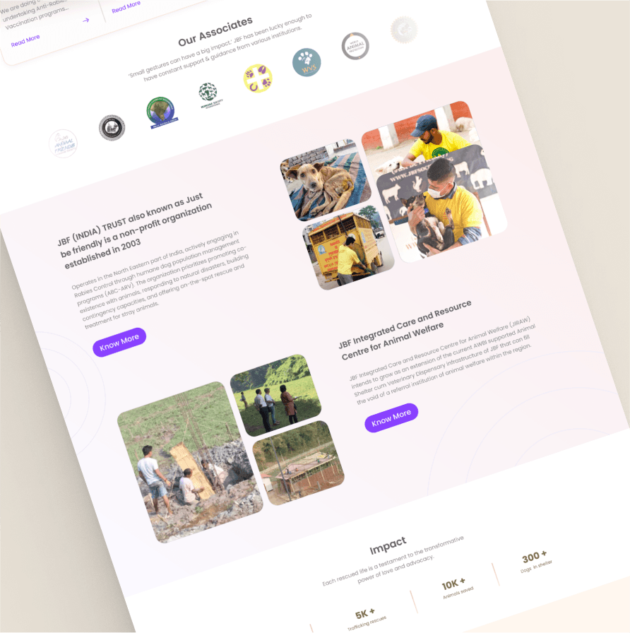
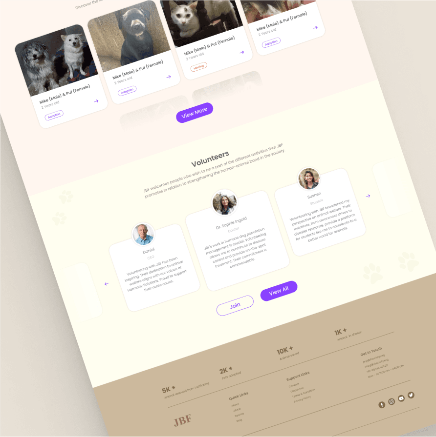
New Design