Explore NorthEast
Explore NorthEast
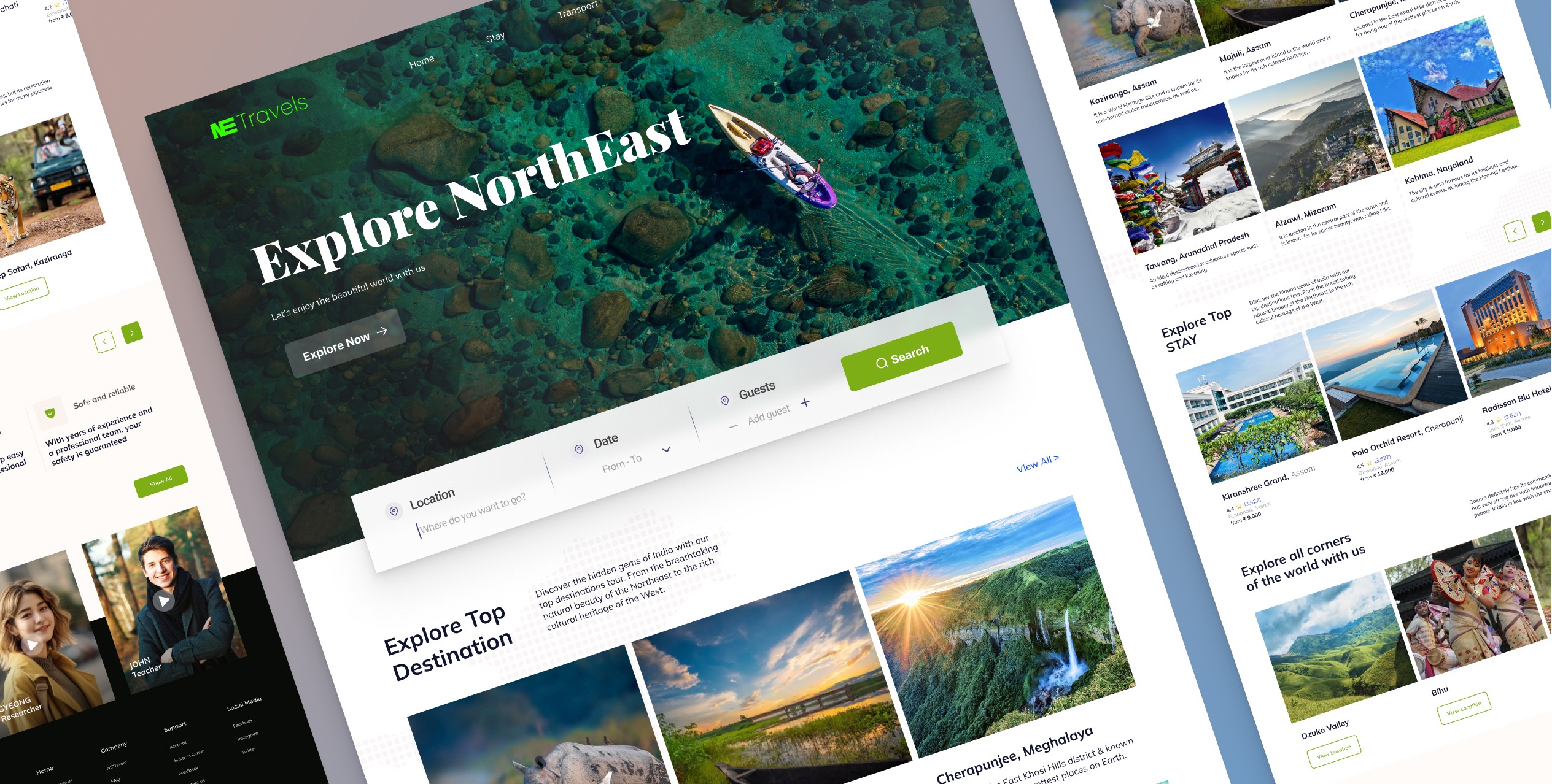
Coming Soon
A site where you can not only book trips but can create one.
Design Process:
01
Identifying the Problem:
Employee demotivation due to low appreciation and a lack of healthy competition. The goal was to create a solution that not only addressed these challenges but also fostered a positive and competitive work environment.
Low-Fidelity Wireframes in Figma:
The design process transitioned to Figma, where low-fidelity wireframes were crafted. These wireframes served as the blueprint, outlining the basic structure and layout of the application.
03
Defining the Vision:
The aim was to turn the workplace into an engaging ecosystem where recognition and achievement are celebrated, leading to increased job satisfaction and productivity.
02
High-Fidelity Design in Figma:
The high-fidelity design added visual elements, color schemes, and finer details, enhancing the overall aesthetics and user experience. This phase focused on ensuring a visually appealing and cohesive design throughout the application.
04
Prototype Development:
High-fidelity screens were used to create a functional prototype in Figma, simulating user journeys for a deeper understanding of transitions and interactions, ensuring a seamless and intuitive experience.
05
Product Promo Video with Adobe AfterEffects:
The goal was to communicate Empedia's value proposition in an engaging and visually appealing manner to advertise.
06
Home:
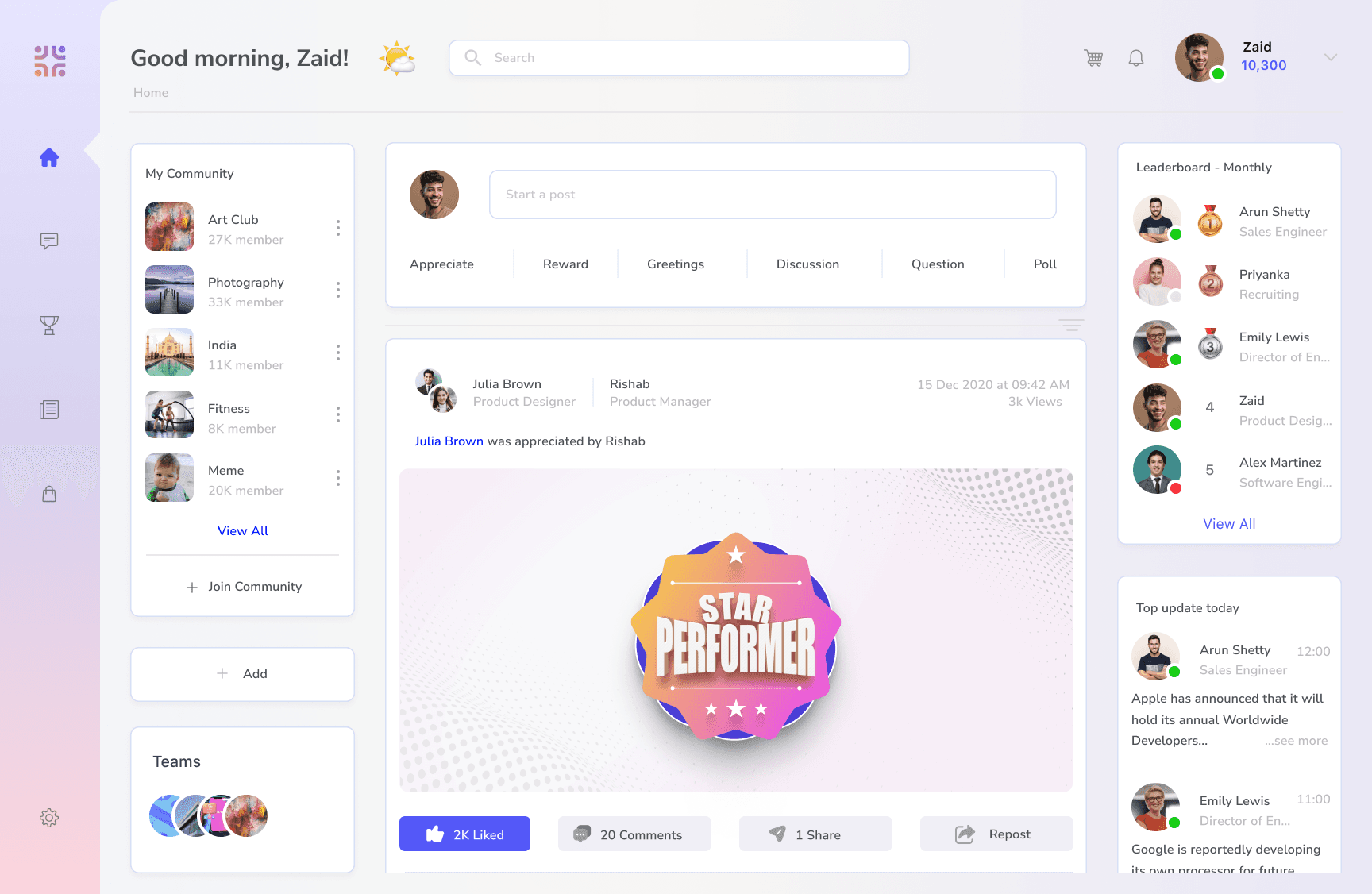
The Home section is the main feed for the employees - This is the default view when user logs in. The main section contains an input field - where user can share appreciations, rewards, greetings, posts, questions, etc. These posts are reflected on the feed. The Feed also contains additional custom widgets like community space, leaderboard, weekly updates, etc. The widget are put in grid format for easy navigation.
Profile:
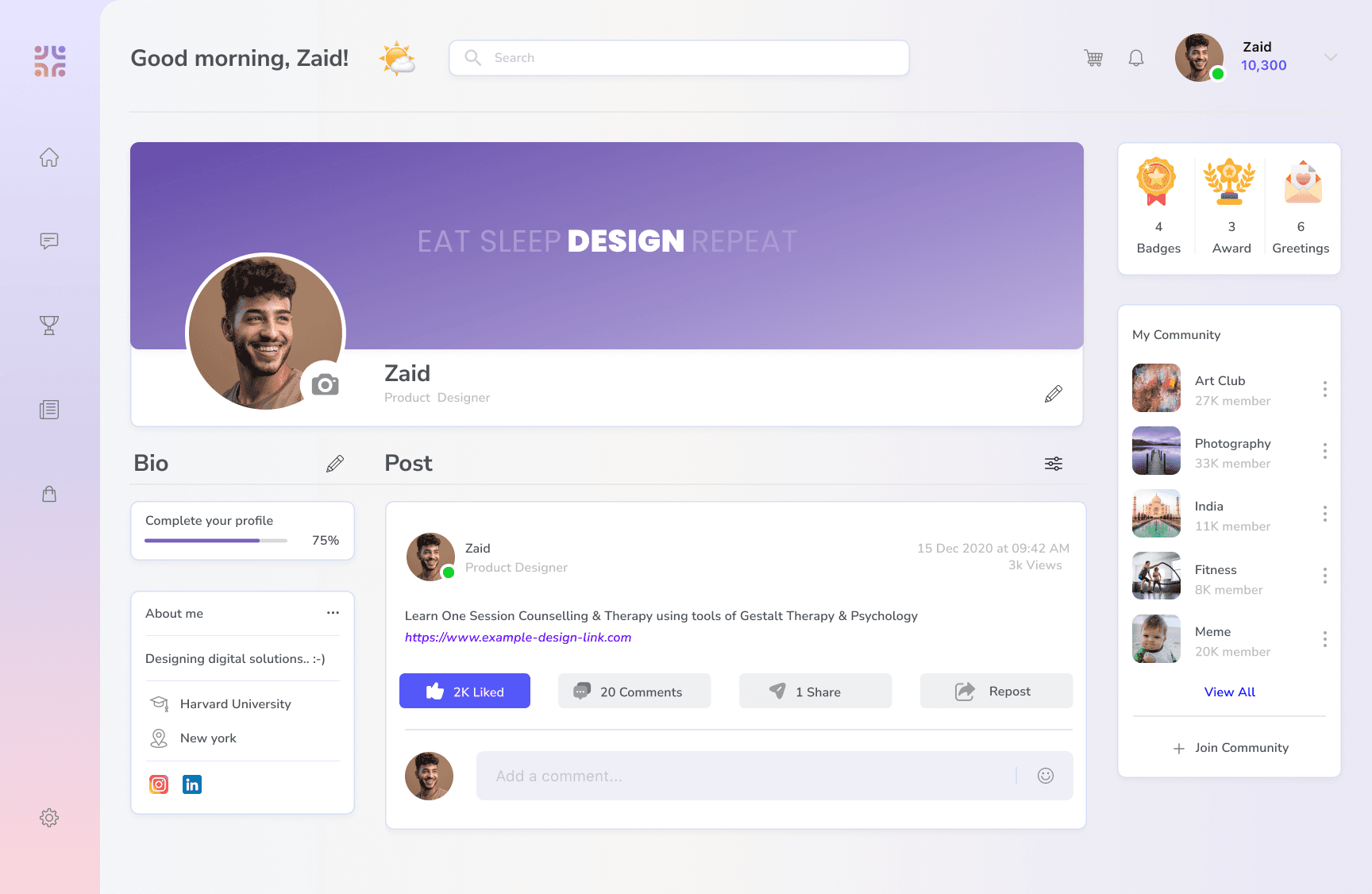
The profile section is a personalized space for the user - where all activities related to them are shown. They can have their own information shown, their cover image, all rewards and badges shown at one place, their posts, the ones they are tagged in and their community spaces. The widget are put in grid format for easy navigation.
Chat:
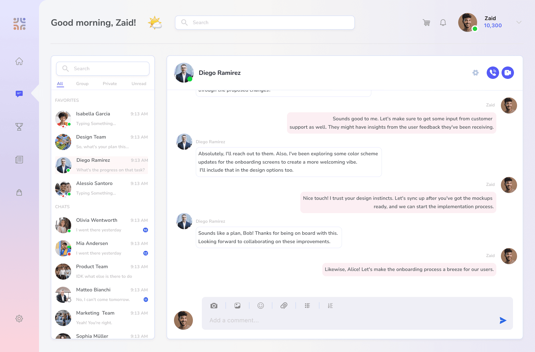
The Chat is the personal messaging space for users to communicate with team members. Users can create and access groups and collaborate better. The UI is made super easy to navigate with increased visibility of each conversation and a list of all chats - individuals and groups.
Award:
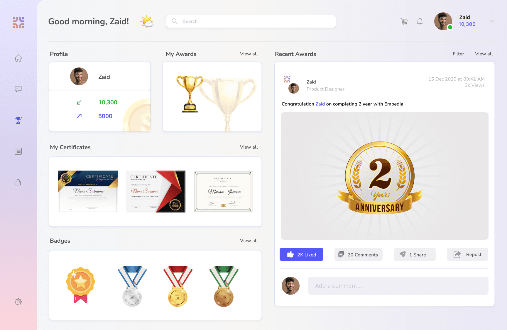
The Award section is the space to view a summary of all recognition (award + badges + certificates) received and given, list of all awards, badges, certificates received, and the recent awards post related to the user - as a receiver or sender. Each section is shown in grid format for easy visibility.
Shopping:
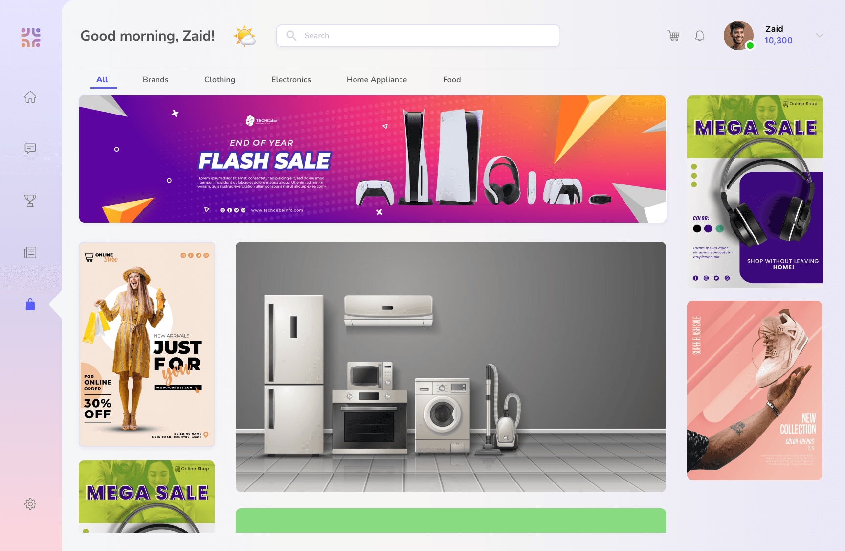
The Shop is the space where all points collected through awards can be redeemed for goods. The UI is kept in the standard e-commerce format - which shows top deals, best products, etc - all in grid format.
News:
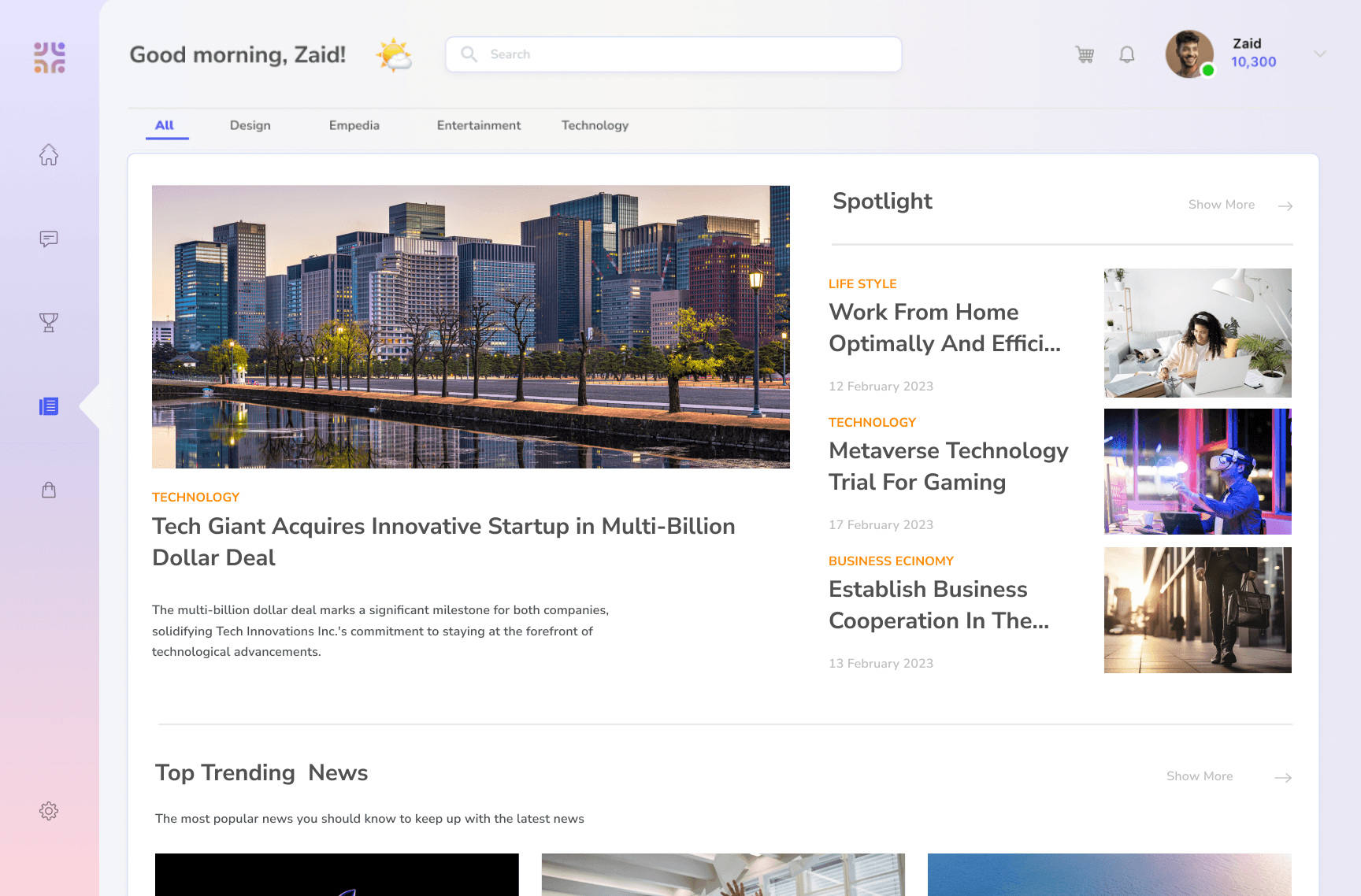
The News is the company and industry-specific news section - collated through the blog and news section of the company.
High-Fidelity wireframe:
As per the above design process, I prepared the low fidelity designs, ideating the user stories, user flows, the design elements, widgets, UX interactions and prototyping. Below are the final high-fidelity designs - highlighting the main features and their design philosophies.