IRCTC Re-Design
My Role
Project Name: IRCTC Re-Design
Duration: 8 hour
Role: Product Designer
Overview
As part of a UI review project, I chose the website of IRCTC. IRCTC (Indian Railway Catering and Tourism Corporation) is a subsidiary of Indian Railways, which manages the catering, tourism, and online ticket booking services of Indian Railways. The IRCTC website is the official website for online railway ticket booking in India. It provides a platform for users to book tickets, check train schedules, seat availability, train fares, and PNR status. Apart from ticket booking, the IRCTC website also offers various tourism packages, including luxury trains, budget tours, and customized travel packages.The intent of IRCTC and its website is to provide a convenient and efficient platform for booking railway tickets and promoting tourism in India.
Below is a UI review of the landing page based on UX laws and design principles.
Goal
• To maintain the user experience in terms of content to satisfy the user intent
• To improve the UI of the landing page to a modern look
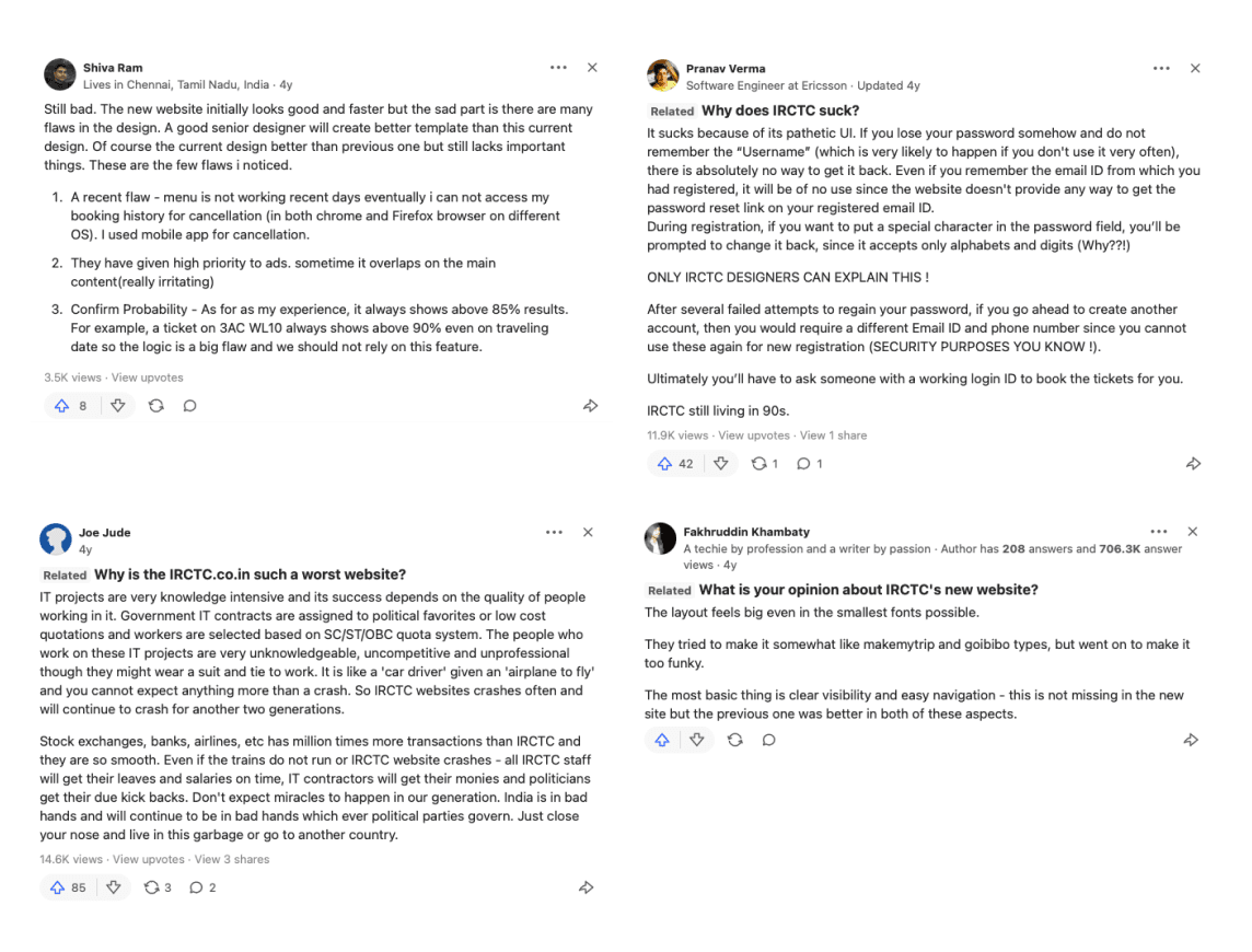
Qualitative research
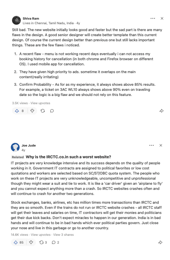
I did research on people's reviews on a feedback page provides valuable insights into their opinions, preferences, and pain points related to the User experience.
Specifically, this type of feedback analysis can contribute to understanding user satisfaction, identifying areas for improvement, and gaining a deeper understanding of the user experience.
What i found is everyone is facing similar issues like
• Inconsistent and cluttered UI
• confusing copies
• Unnecessary Coloured icons are too bright and distracting
• Alignment issue

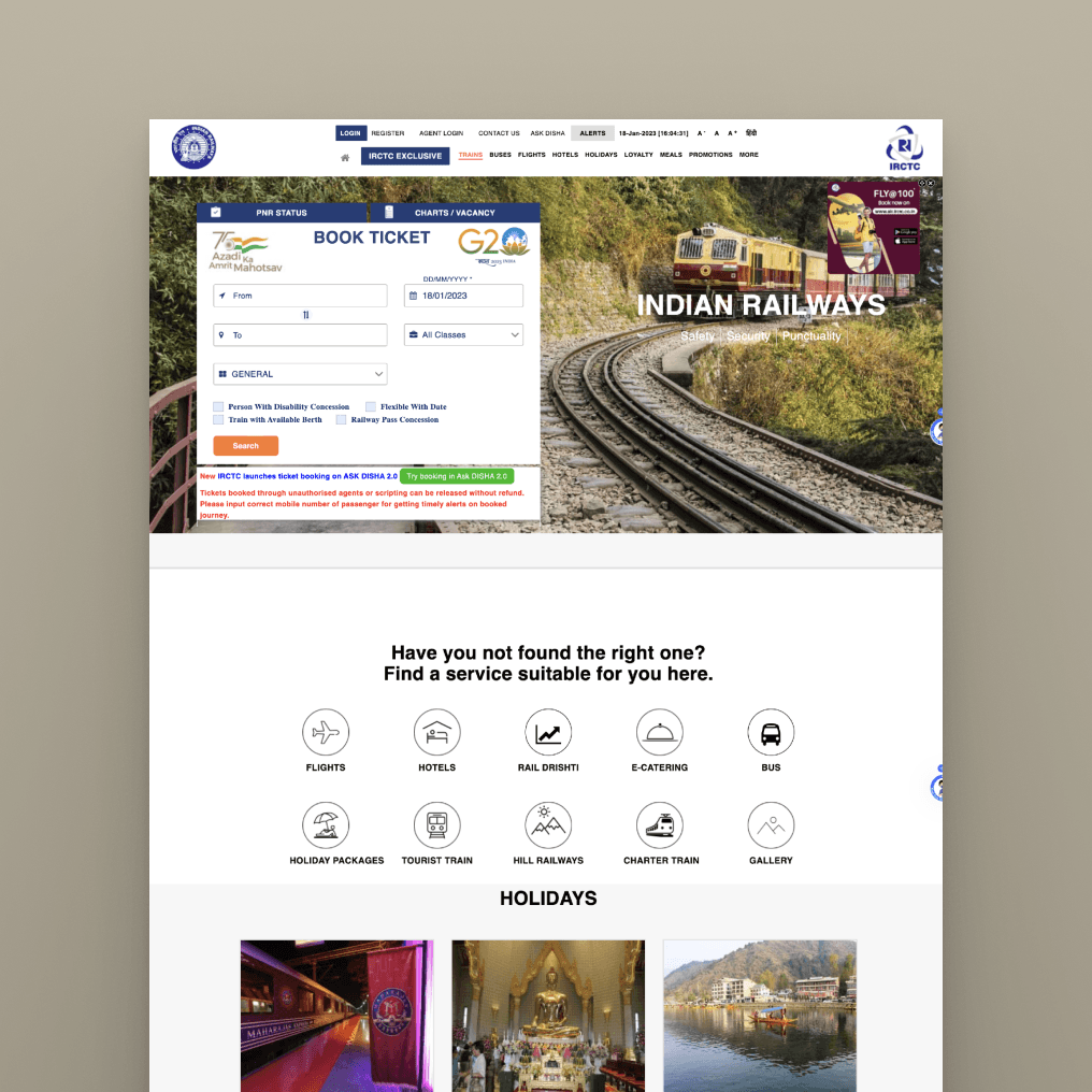
UX/UI Review
This review evaluates the UI and UX of the IRCTC website.
• It emphasizes the design elements' role in enhancing user interaction, particularly focusing on the usability and efficiency of ticket booking widgets, which are central to the site's function.
• The website's navigation is analyzed for its intuitive layout and flow, enabling easy movement across various sections.
• The impact of spacing and icon use on the site's aesthetic and functionality is also examined.
• Moreover, the clarity and placement of error messages are scrutinized for their contribution to the overall user experience, highlighting their importance in user interactions.
This analysis considers the IRCTC's diverse target audience, ranging from the lower to upper-middle class in India. This demographic variety presents unique design challenges, underscoring the need for a UI and UX that cater to different levels of digital literacy and accessibility.The review underscores the necessity of balancing aesthetic appeal and efficiency with accessibility and user-friendliness to meet the diverse needs of IRCTC's users.

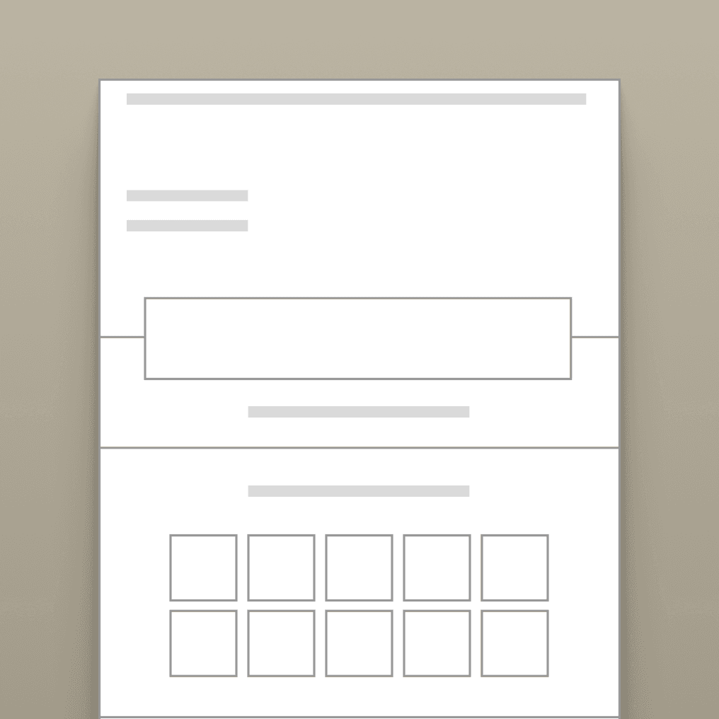
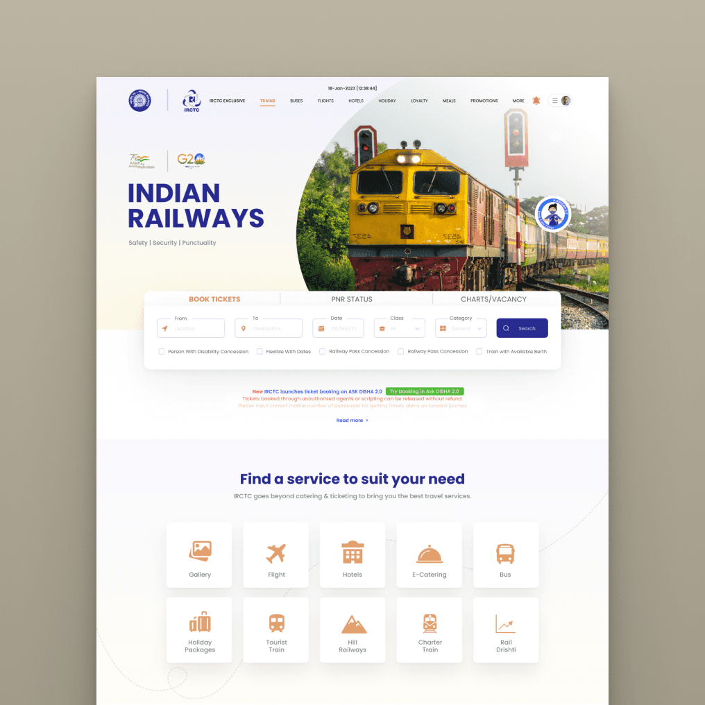
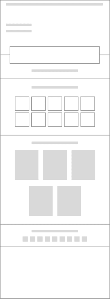
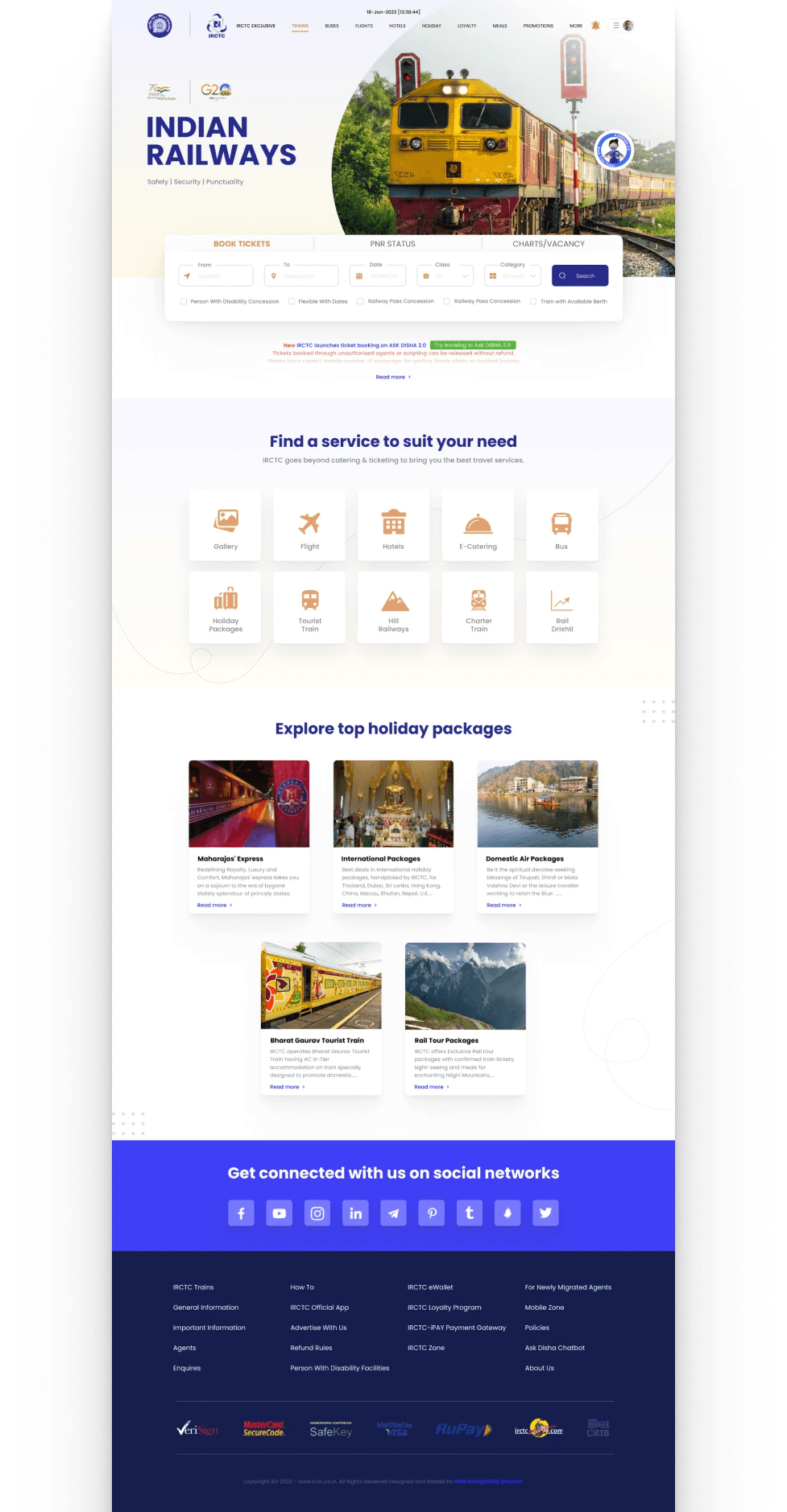
Wireframe
The wireframe I designed, while largely aligned with the existing IRCTC website, incorporates improvements to enhance the overall user experience, aesthetic appeal, and accessibility. These modifications are tailored to better serve the diverse user base, ensuring the website is functional, more visually engaging, and easier for all users to navigate, regardless of their tech proficiency. This approach aims to elevate the site's usability, making it a more effective and enjoyable tool for travelers across India.
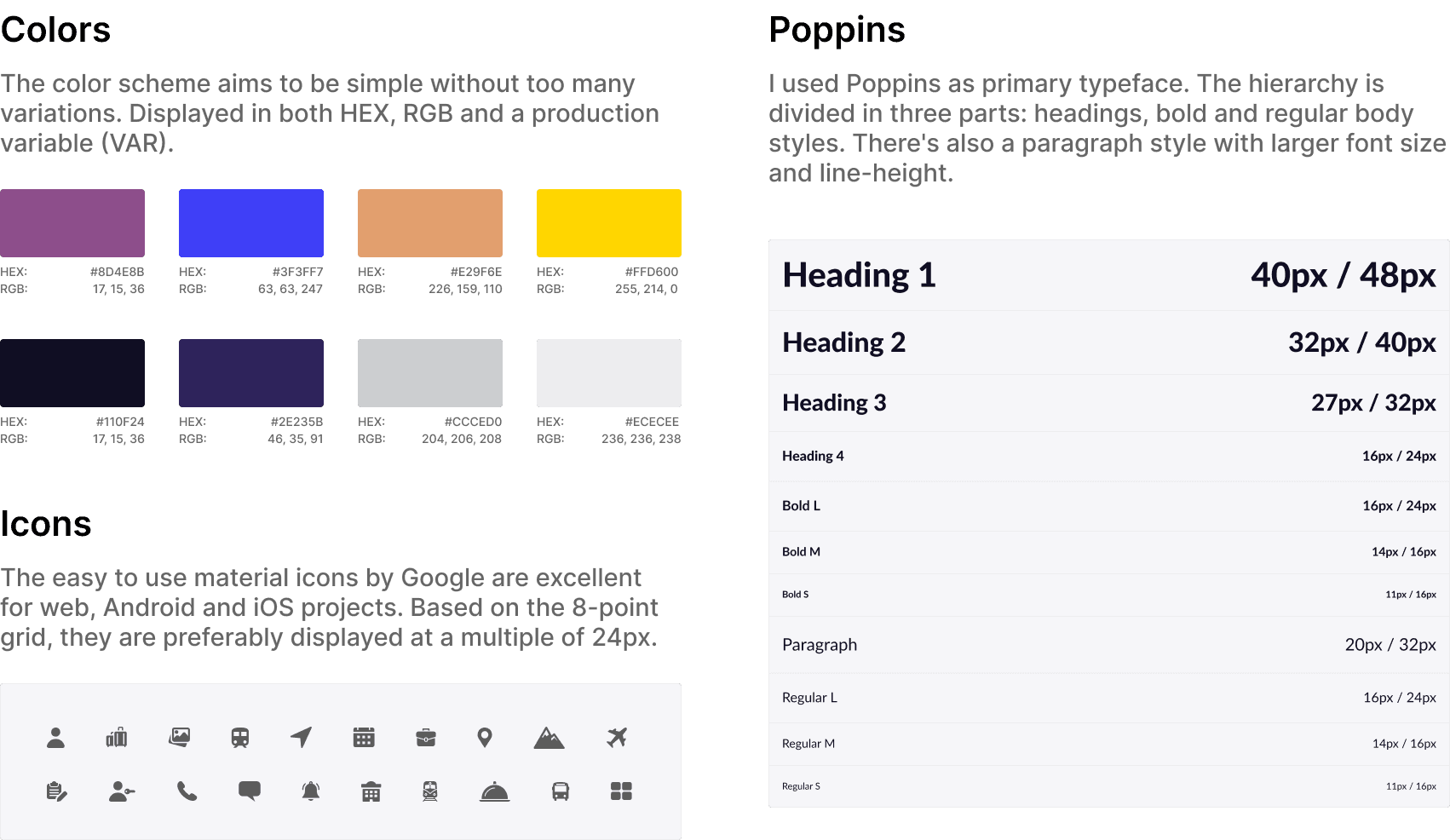
Style Guide
The style guide includes a detailed overview of the color palette chosen for its visual appeal and ease of use, ensuring that information is accessible and engaging for all users.I have also highlighted the selection of fonts, prioritizing readability and user-friendliness to accommodate a wide range of users, from tech-savvy individuals to those with minimal digital experience.Additionally, I have outlined the custom-designed icons, crafted to be intuitive and universally recognizable, aiding in seamless navigation across the website.
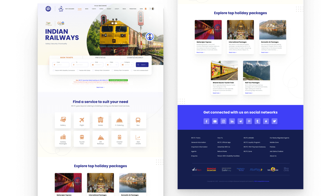
Conclusion
The redesigned IRCTC website blends functionality with aesthetic appeal. My aim was to significantly enhance user experience along with accessibility. Carefully chosen colors, fonts, and intuitive icons cater to a diverse audience, ensuring ease of use. This overhaul modernizes the interface and reaffirms IRCTC's commitment to inclusive, user-friendly service.