Empedia

Empedia

My Role

Project Name: Empedia

Duration: 30 hour
Role: Product Designer

Overview

Empedia: Revolutionizing Workplace Connectivity and Recognition

In the fast-paced landscape of modern workplaces, fostering a sense of community, recognition, and effective communication is pivotal for organizational success.
Empedia is a groundbreaking web application that redefines the way employees connect, appreciate each other, and stay informed within an organization. This social media cum rewards and recognition tool is designed to enhance collaboration, boost morale, and create a positive work culture.

Design Philosophy:

Appreciation Made Visual:
The design philosophy behind the appreciation and recognition feature is to make it visually impactful. Vibrant graphics and intuitive icons enhance the appreciation process, turning it into a delightful experience. Managers and higher officials have a streamlined interface for recognizing and rewarding outstanding contributions, creating a visually rewarding journey.

Rewards System Integration and Shopping Experience:
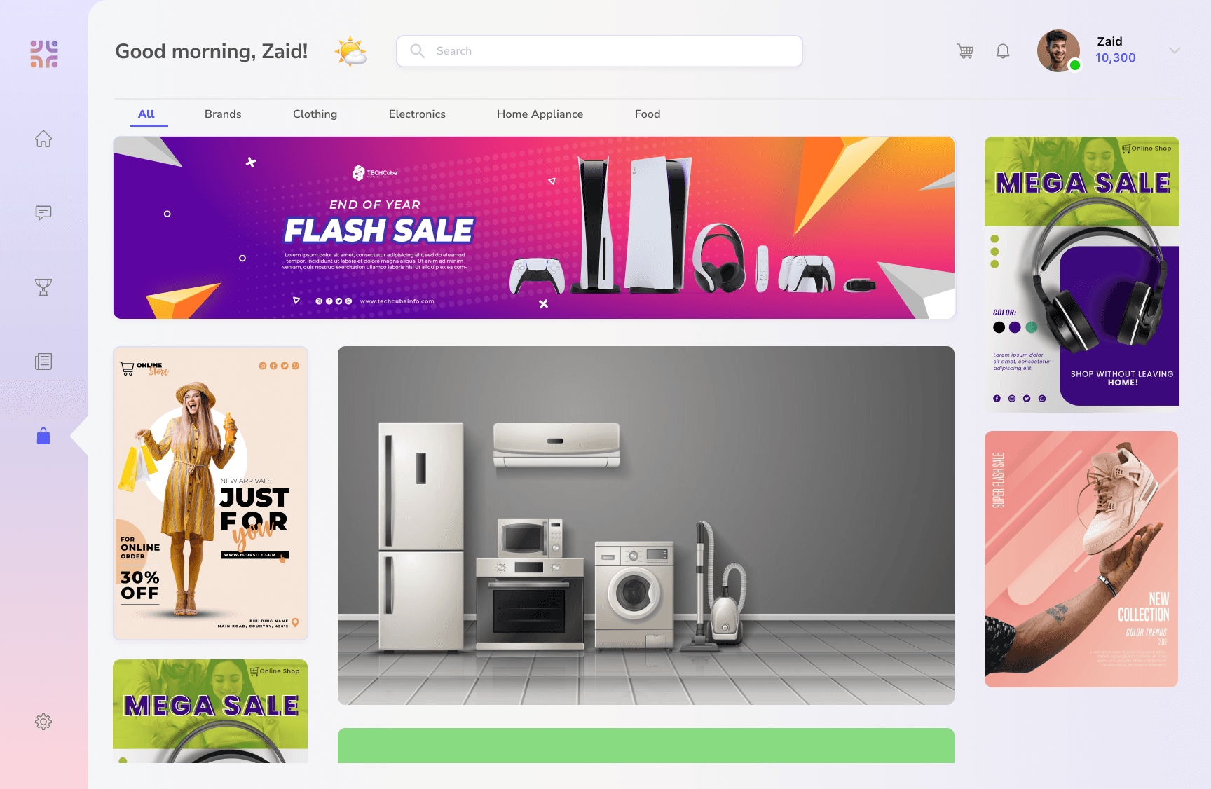
The rewards system is seamlessly integrated into Empedia's design, featuring a dedicated section showcasing earned points. The design ensures a visually stimulating presentation, enticing users to explore the diverse array of online brands available for redemption. This thoughtful integration transforms the rewards system into a tangible and exciting prospect, motivating employees not only through recognition but also by offering a unique shopping experience within the platform.

Secure and Intuitive Messaging:
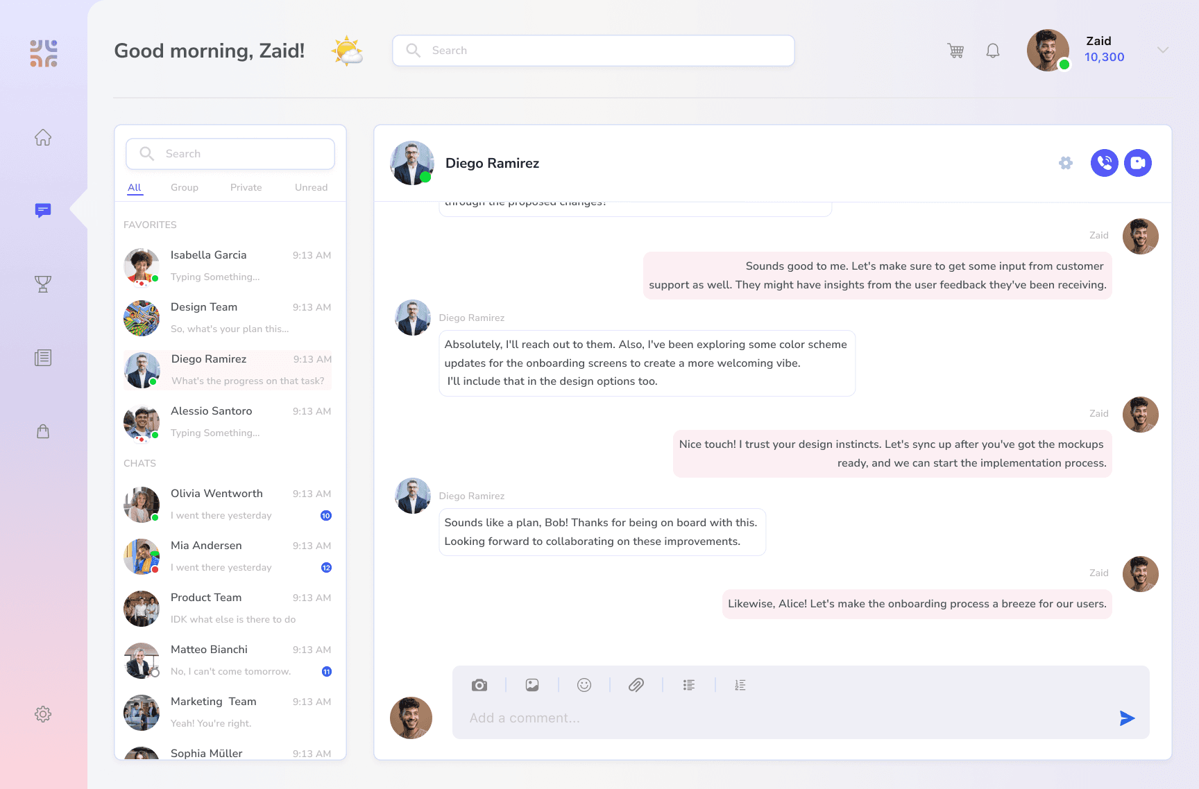
The chat feature is designed to be both secure and intuitive. A clean and straightforward interface promotes direct communication, fostering meaningful connections among employees. The design ensures that messaging is not just a feature but a tool that enhances collaboration and builds camaraderie.

Engaging Feed:
The heart of Empedia lies in its captivating news feed, carefully crafted to resemble familiar social media interfaces. This design approach encourages employees to seamlessly post updates, share knowledge, and engage with content, creating a dynamic and vibrant virtual space.

Company News in Focus:
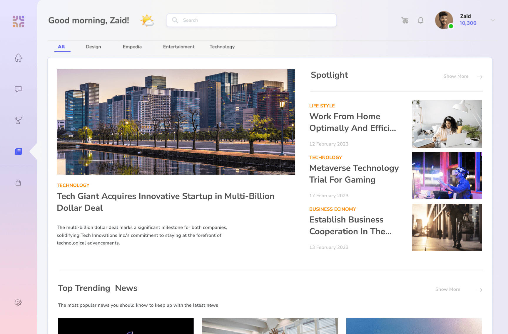
Keeping employees informed is a central design goal. The section dedicated to company news and updates employs a clean and organized layout, ensuring that important information is easily accessible. The design promotes a sense of transparency and inclusivity, keeping employees engaged and aligned with organizational goals.

Design Process:

01

Identifying the Problem:

Employee demotivation due to low appreciation and a lack of healthy competition. The goal was to create a solution that not only addressed these challenges but also fostered a positive and competitive work environment.

Low-Fidelity Wireframes in Figma:

The design process transitioned to Figma, where low-fidelity wireframes were crafted. These wireframes served as the blueprint, outlining the basic structure and layout of the application.

03

Defining the Vision:

The aim was to turn the workplace into an engaging ecosystem where recognition and achievement are celebrated, leading to increased job satisfaction and productivity.

02

High-Fidelity Design in Figma:

The high-fidelity design added visual elements, color schemes, and finer details, enhancing the overall aesthetics and user experience. This phase focused on ensuring a visually appealing and cohesive design throughout the application.

04


Prototype Development:

High-fidelity screens were used to create a functional prototype in Figma, simulating user journeys for a deeper understanding of transitions and interactions, ensuring a seamless and intuitive experience.

05

Product Promo Video with Adobe AfterEffects:

The goal was to communicate Empedia's value proposition in an engaging and visually appealing manner to advertise.

06

Design Process:

  • 01

    Identifying the Problem:

    Empedia's design journey began with a crucial issue: employee demotivation due to low appreciation and a lack of healthy competition. The goal was to create a solution that not only addressed these challenges but also fostered a positive and competitive work environment.

  • Defining the Vision:

    The aim was to turn the workplace into an engaging ecosystem where recognition and achievement are celebrated, leading to increased job satisfaction and productivity.

    02

  • Low-Fidelity Wireframes in Figma:

    The design process transitioned to Figma, where low-fidelity wireframes were crafted. These wireframes served as the blueprint, outlining the basic structure and layout of the application.

    03

  • High-Fidelity Design in Figma:

    The high-fidelity design added visual elements, color schemes, and finer details, enhancing the overall aesthetics and user experience. This phase focused on ensuring a visually appealing and cohesive design throughout the application.

    04

  • Prototype Development:

    High-fidelity screens were used to create a functional prototype in Figma, simulating user journeys for a deeper understanding of transitions and interactions, ensuring a seamless and intuitive experience.

    05

  • Product Promo Video with Adobe AfterEffects:

    The goal was to communicate Empedia's value proposition in an engaging and visually appealing manner to advertise.

    06

High-Fidelity wireframe:

As per the above design process, I prepared the low fidelity designs, ideating the user stories, user flows, the design elements, widgets, UX interactions and prototyping. Below are the final high-fidelity designs - highlighting the main features and their design philosophies.

Home:

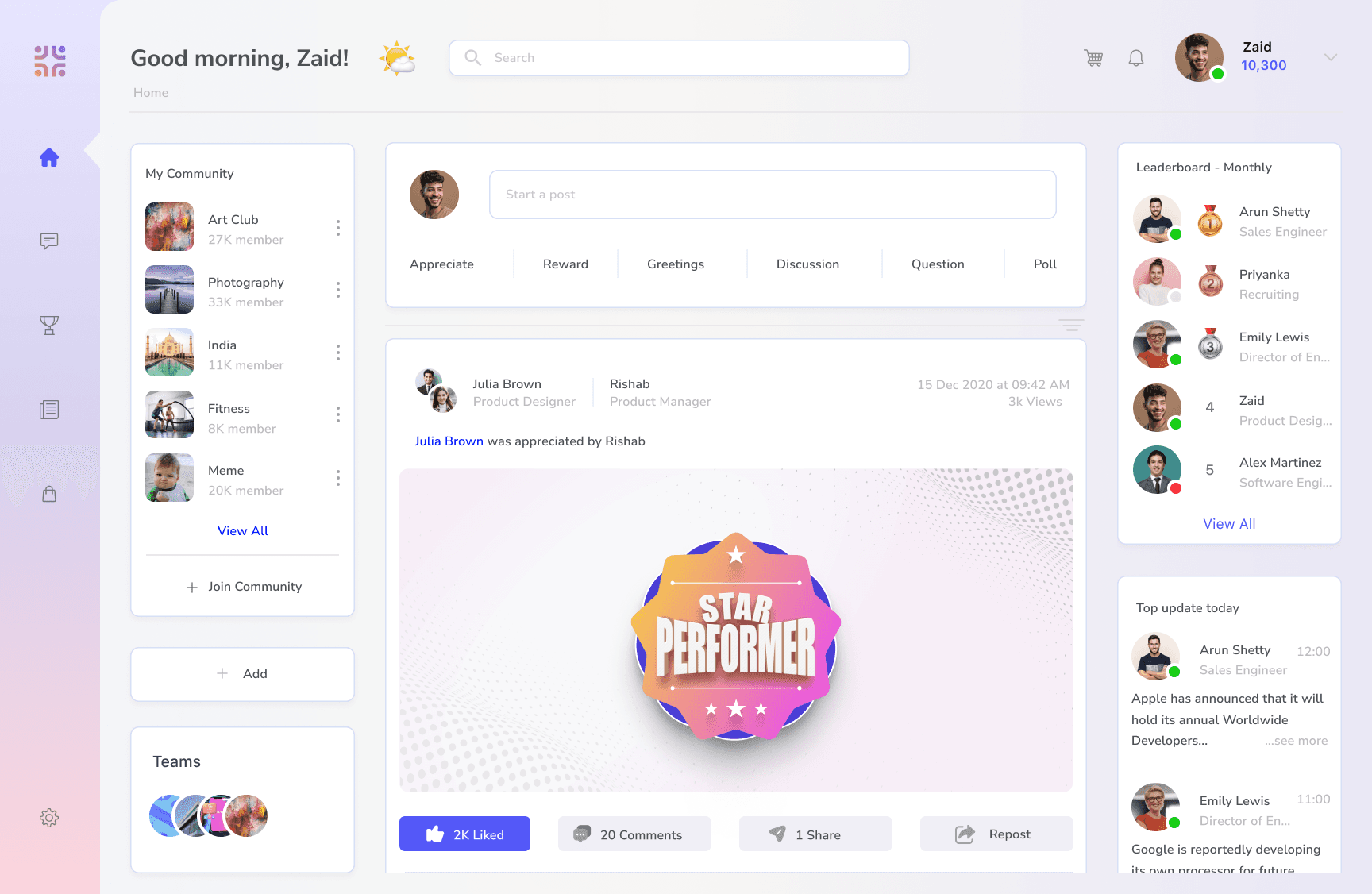
The Home section is the main feed for the employees - This is the default view when user logs in. The main section contains an input field - where user can share appreciations, rewards, greetings, posts, questions, etc. These posts are reflected on the feed. The Feed also contains additional custom widgets like community space, leaderboard, weekly updates, etc. The widget are put in grid format for easy navigation.

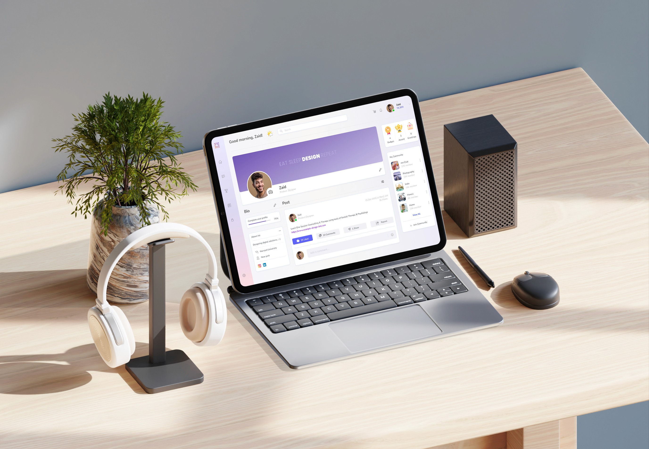
Profile:

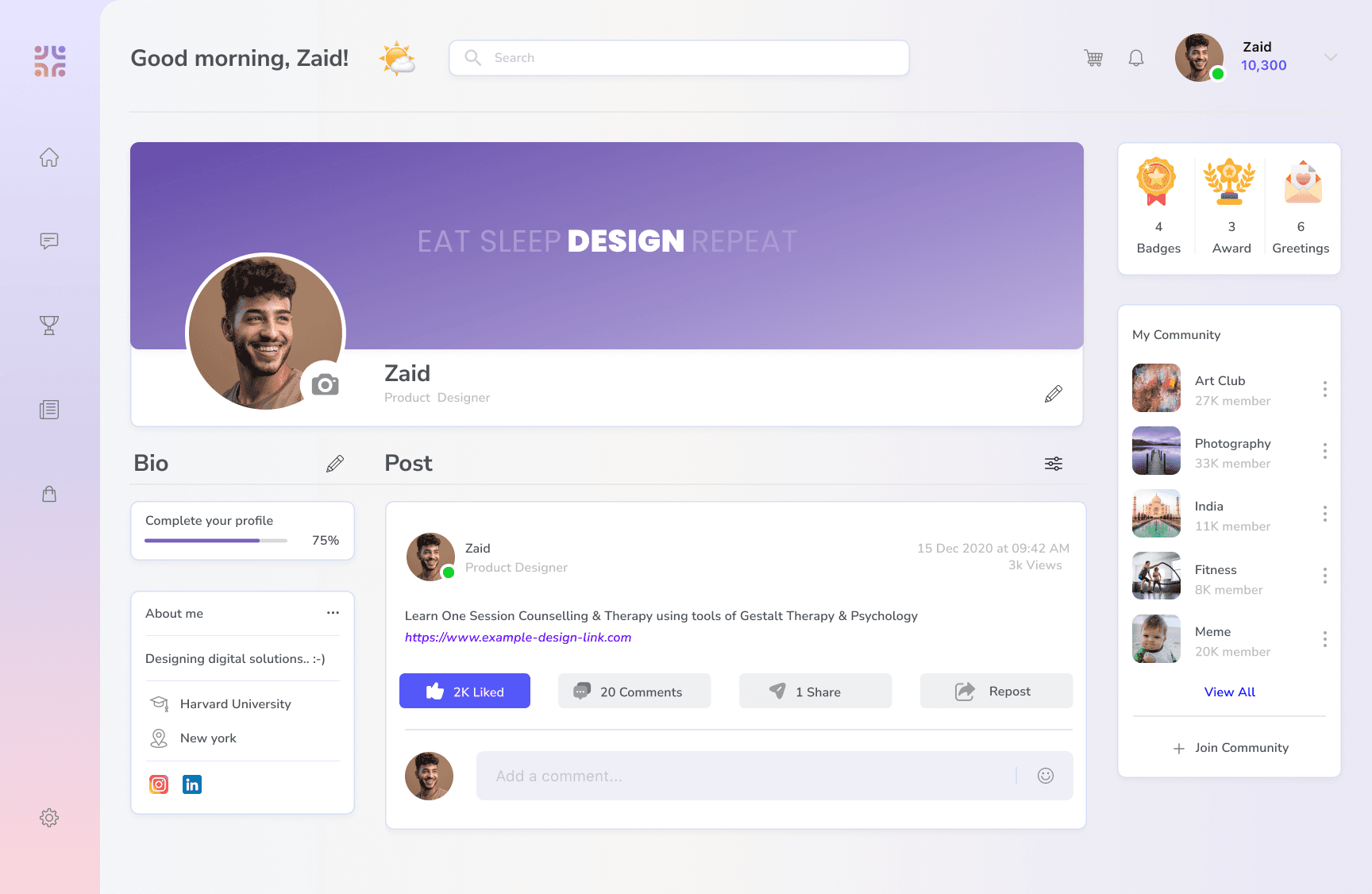
The profile section is a personalized space for the user - where all activities related to them are shown. They can have their own information shown, their cover image, all rewards and badges shown at one place, their posts, the ones they are tagged in and their community spaces. The widget are put in grid format for easy navigation.

Chat:

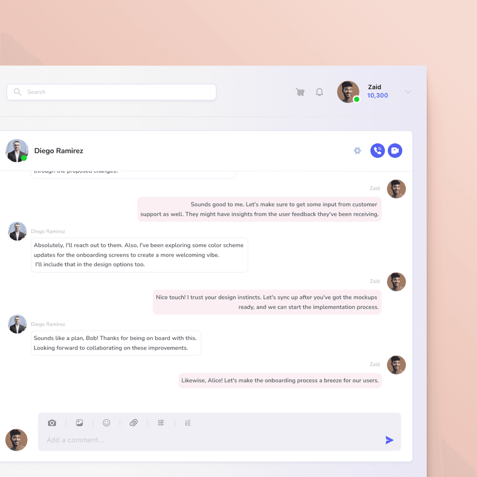
The Chat is the personal messaging space for users to communicate with team members. Users can create and access groups and collaborate better. The UI is made super easy to navigate with increased visibility of each conversation and a list of all chats - individuals and groups.

Award:

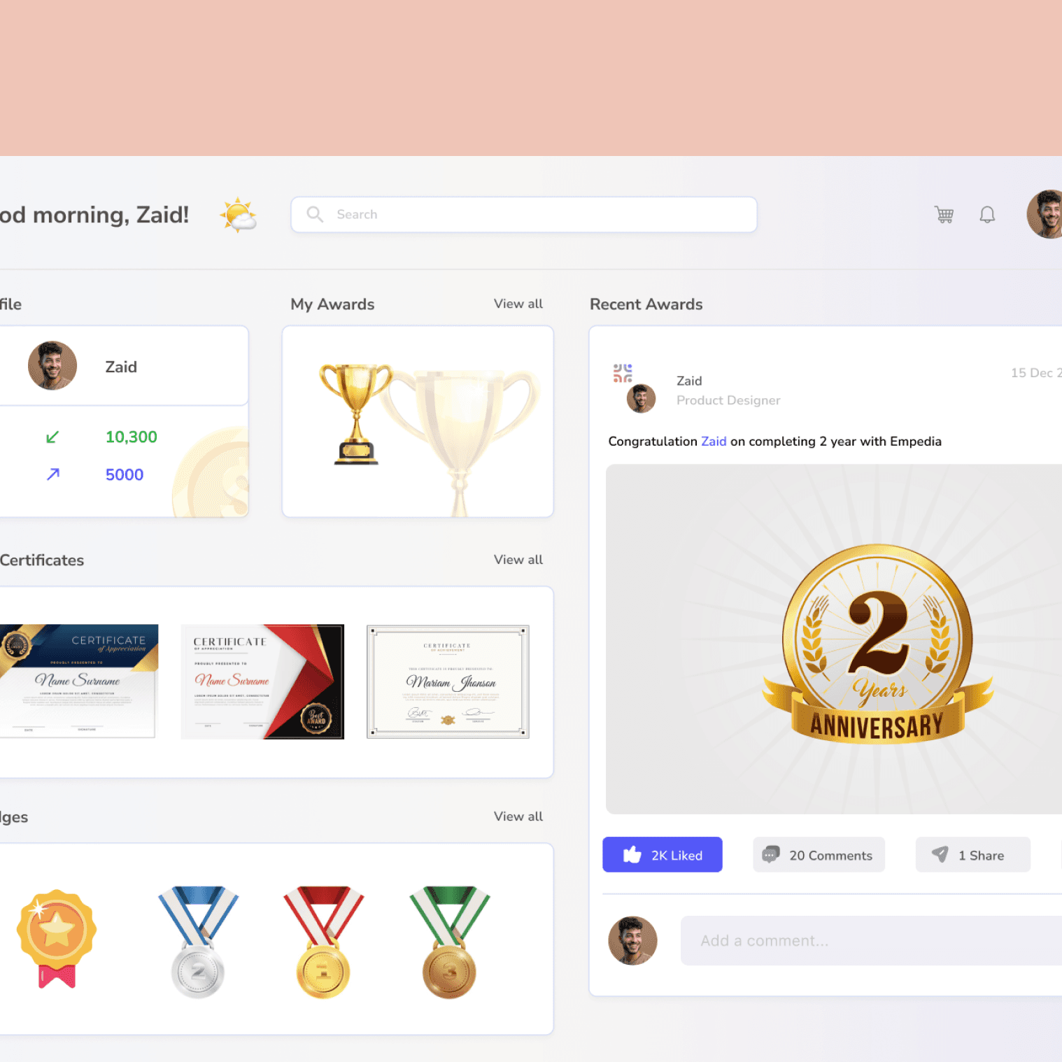
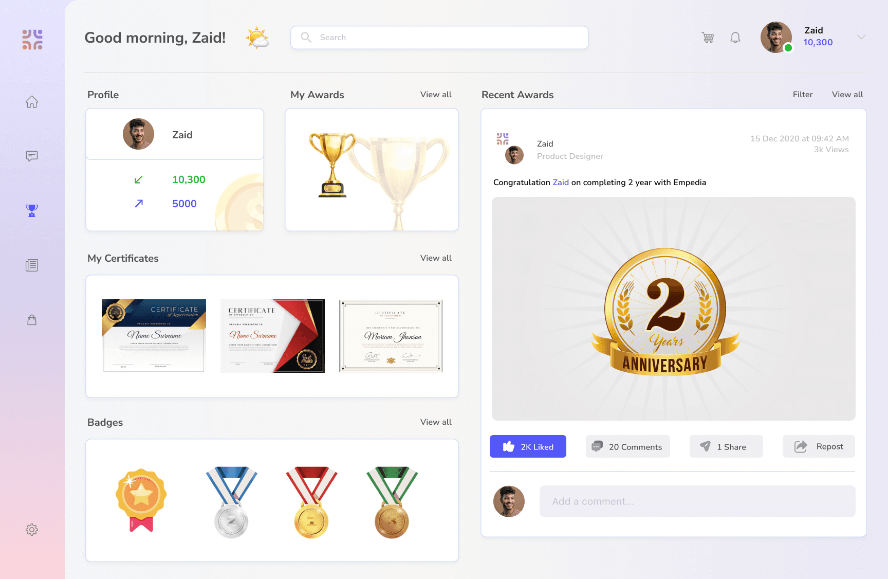
The Award section is the space to view a summary of all recognition (award + badges + certificates) received and given, list of all awards, badges, certificates received, and the recent awards post related to the user - as a receiver or sender. Each section is shown in grid format for easy visibility.

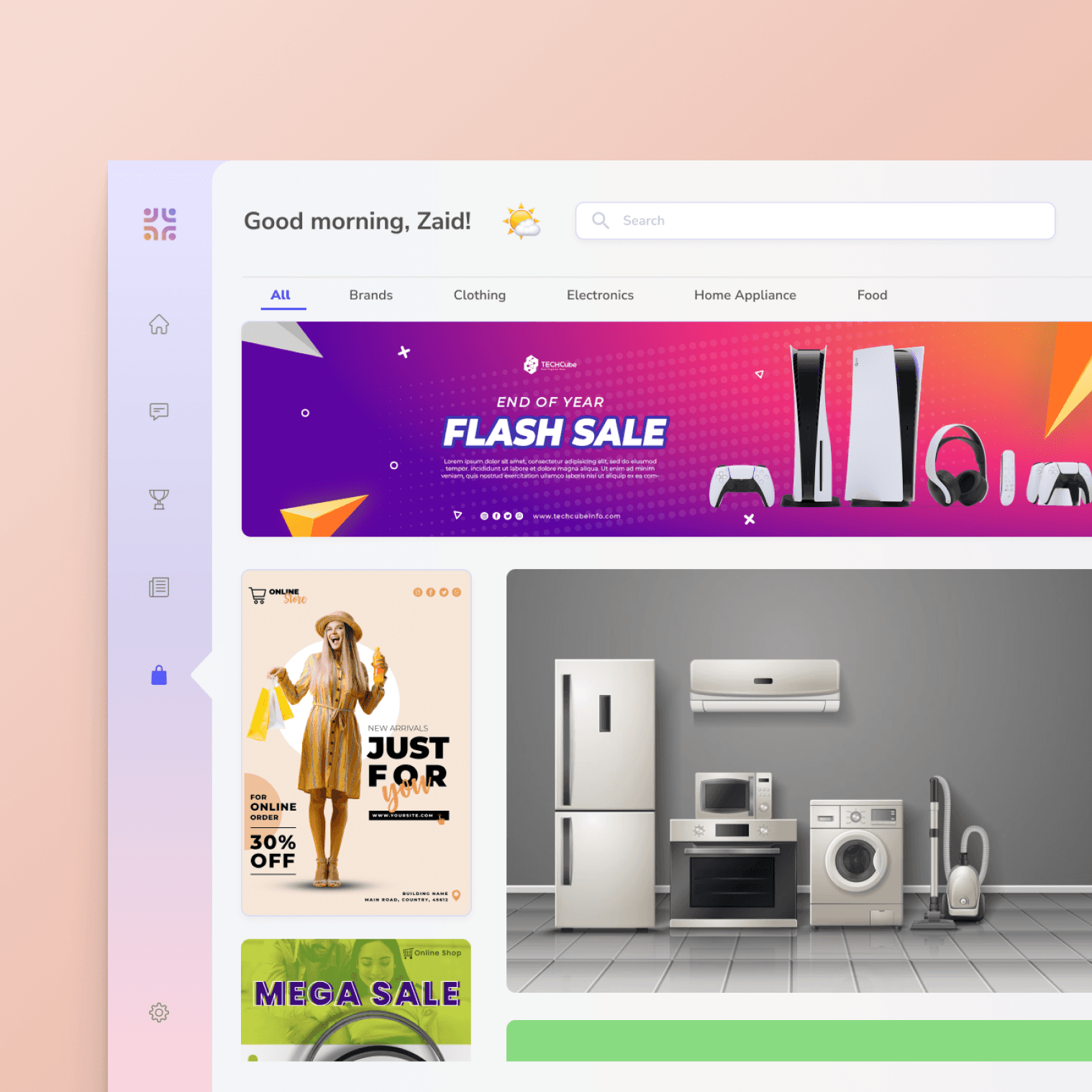
Shopping:

The Shop is the space where all points collected through awards can be redeemed for goods. The UI is kept in the standard e-commerce format - which shows top deals, best products, etc - all in grid format.

News:

The News is the company and industry-specific news section - collated through the blog and news section of the company.

Product Video

Product promotion video created with After Effects

Empedia Mobile

For mobile version visit here

Home:

The Home section is the main feed for the employees - This is the default view when user logs in. The main section contains an input field - where user can share appreciations, rewards, greetings, posts, questions, etc. These posts are reflected on the feed. The Feed also contains additional custom widgets like community space, leaderboard, weekly updates, etc. The widget are put in grid format for easy navigation.

Profile:

The profile section is a personalized space for the user - where all activities related to them are shown. They can have their own information shown, their cover image, all rewards and badges shown at one place, their posts, the ones they are tagged in and their community spaces. The widget are put in grid format for easy navigation.

Chat:

The Chat is the personal messaging space for users to communicate with team members. Users can create and access groups and collaborate better. The UI is made super easy to navigate with increased visibility of each conversation and a list of all chats - individuals and groups.

Award:

The Award section is the space to view a summary of all recognition (award + badges + certificates) received and given, list of all awards, badges, certificates received, and the recent awards post related to the user - as a receiver or sender. Each section is shown in grid format for easy visibility.

Shopping:

The Shop is the space where all points collected through awards can be redeemed for goods. The UI is kept in the standard e-commerce format - which shows top deals, best products, etc - all in grid format.

Product Video

Product promotion video created with After Effects

Empedia Mobile

For mobile version visit here

News:

The News is the company and industry-specific news section - collated through the blog and news section of the company.


High-Fidelity wireframe:

As per the above design process, I prepared the low fidelity designs, ideating the user stories, user flows, the design elements, widgets, UX interactions and prototyping. Below are the final high-fidelity designs - highlighting the main features and their design philosophies.

Conclusion

The design process for Empedia was a journey from identifying a critical workplace problem to crafting a comprehensive solution. By leveraging Figma for wireframing and prototyping and Adobe AfterEffects for the product promo video, each phase of the process was meticulously executed. Empedia stands as a testament to the iterative and user-centric design approach, ensuring that the final product not only addressed the initial problem but also exceeded user expectations, creating a positive and engaging workplace experience.
© 2024 alberdbrahma.

© 2024 alberdbrahma.